Idea!
Thursday, November 30, 2006


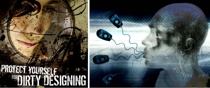
I found some interesting graphic design on this website http://www.anna-om-line.com and really love idea and colors the logan on the third image "Love is in the air...". I also like the shape of the first image, the curse of the second image.
posted by Nguyen Thi Hong Chau at 11:52 PM | Permalink | 0 comments
Valentine Party Poster!
Thursday, November 23, 2006

I found this poster on the site: http://www.ohames.lu , it really attracted me.
posted by Nguyen Thi Hong Chau at 7:43 PM | Permalink | 0 comments
The Forest!


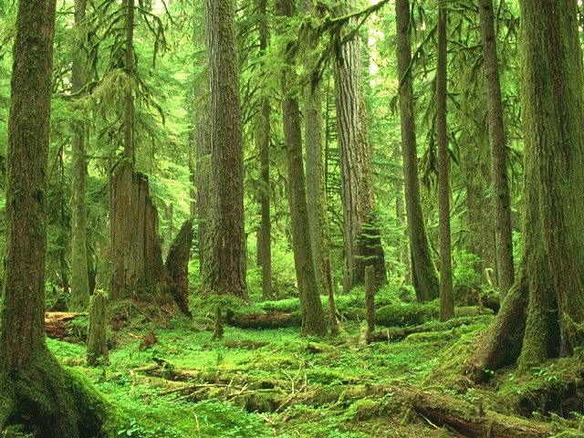
The first image is the original image of a beauty forest I took from internet.

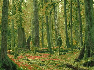
With the first design, I used Replace Color tool in Photoshop and changed the green grass on the land to red color and it looked like a carpet of red flower. Then I also changed the green leaf to orange color. Now, with the whole image, the forest is in summer season.

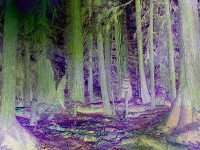
The second design is an opposite with the first one. With the help of Filter Render tool, the forest looked dark, like after a burning.

posted by Nguyen Thi Hong Chau at 6:02 PM | Permalink | 1 comments
Dangerous!
Sunday, November 19, 2006


I used pen in Photoshop to type word dangerous with red color to make it likes a strong warming. I decided to use pen because I think with types of normal fonts we often use won't make the warming more effective than when it look a bits messy.

posted by Nguyen Thi Hong Chau at 9:01 PM | Permalink | 0 comments
We won't stop here
Wednesday, November 15, 2006

Another poster design on this site http://www.psu.edu/ur/archives/intercom_2002/Nov21/ . This poster is for education. This is the winning poster design by undergraduate graphic design and photography student Roman Shuman depicts a future, symbolized by the tree, in which prejudices will not cause such suffering as is so often the case today. The boy is the civil rights movement that has brought great change in seeking that goal, but which cannot rest on its laurels. The black land where the boy's standing is opposite with the sky - good future above him
posted by Nguyen Thi Hong Chau at 8:04 PM | Permalink | 0 comments
Poster Design

I found this poster design on this site http://www.photoshopuserawards.com . I don't really know this advertisement is for a play or a movie but this design really attract me. The title of this play(or movie) is Angel Street, plus they used red for this background remind me bloody and something violence may happen.
posted by Nguyen Thi Hong Chau at 7:05 PM | Permalink | 0 comments
Text Design
Wednesday, November 08, 2006
I used Tahoma type for this text design. The first thing I think about is the information. I used very big size for "B" with black color to attract audiances and also to tell them that this is a big event. Then I added information inside.

I used Time New Romanse type for the text below. It took me a minute to think about grouping 3 words: big band and blowout together because they have the same first character.

posted by Nguyen Thi Hong Chau at 6:45 AM | Permalink | 0 comments
Leaving me behind!
Wednesday, November 01, 2006
This is the original image I took on the Internet.

This is effect after I used Photoshop to change light.


posted by Nguyen Thi Hong Chau at 8:43 PM | Permalink | 0 comments
My Logo!

Last week in my class DIM2, I was asked to design an image describing myself. It took me a day to think about. And this is the final product.

Let me explain the image:
The circle is a symbol of the earth, the person standing on the earth is me. This means reality.
The ladder with the moon above (when I used Illustrator drawing the moon, I set its color yellow) mean unreal, a dream.
In all, I’m a dreaming person. But I think dreaming makes life easier to live and you guys have your own dreams too, although they may never comes true.
posted by Nguyen Thi Hong Chau at 8:39 PM | Permalink | 0 comments