Dark Moon
Smoking Poster!
Sunday, September 02, 2007
Safe Sex
Sunday, August 26, 2007
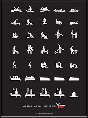
Safe Sex Design!
 Safe Sex Design is another design I made for Assignment 2B. When I started working for this design, I got many troubles and how to make a poster that attract people. I searched on internet and would like to take photo for the poster; however, I gave up this idea because I couldn't find a model. Finally, I found some sex icons on internet, I used Illustrator to redraw them, and based on that I created others. The poster looks funny with sex icons and I think it may attract people.
My Portrait!
Gestalt Exercise!
Saturday, July 14, 2007
My logo designs!
Thursday, July 05, 2007
Photoshop Exercise!
Prudential Logo
Tuesday, July 03, 2007
Abstract!!
Thursday, January 04, 2007
Kohler Design Center!!
Shape and line!

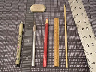
Source 1: http://images.channeladvisor.com/Sell/SSProfiles/10047354/Images/
HHneonPINK&green.jpg
Source 2: https://www.andrew.cmu.edu/user/tetani/upcycleart/images/milkcarton_tools/
images/milkcartontools.jpg
China Design!!
 Source: http://www.il.mahidol.ac.th/image/news/board/chaina.jpg
Now, let's start looking for some China designs
Think Good!!
Live a life!
Japan Design!!


Source: http://www.illustration.animacia.sk/view_a.htm
I start liking Japan design when I found a book about Japan Design in library, those designs were combination of Japan culture and modern design, and now I start searching for more.
Snow Flower in Cover Design!
Wednesday, December 20, 2006
The Rhythm of Snow !
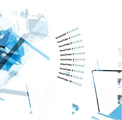

Source: http://www.carvalhais.org/design/2001/snow/
Really amazing, snow designs combine text layout.
Snowflakes in Design!
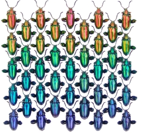

 Source: http://sammibag.typepad.com/sammibag/the_art_of_design/index.html
An example of design idea using snowflakes.
Snowflakes!!
 Source: http://www.printables.thecraftcafe.com/snowflake.jpg
Well, Christmas is about to come. Vietnam doesn't have winter and of course I never see a snowflakes. However, by seeing snowflakes on magazine, I really like them. We can't find 2 snowflakes that look exacly the same and that made them special.
